Eventrac’s Stunning Data Visualisations - Making Sense of Numbers
We’re all aware of the building blocks of business intelligence, numerous spreadsheets containing countless columns and rows packed with names and numbers.
We’re all aware of the building blocks of business intelligence, numerous spreadsheets containing countless columns and rows packed with names and numbers.
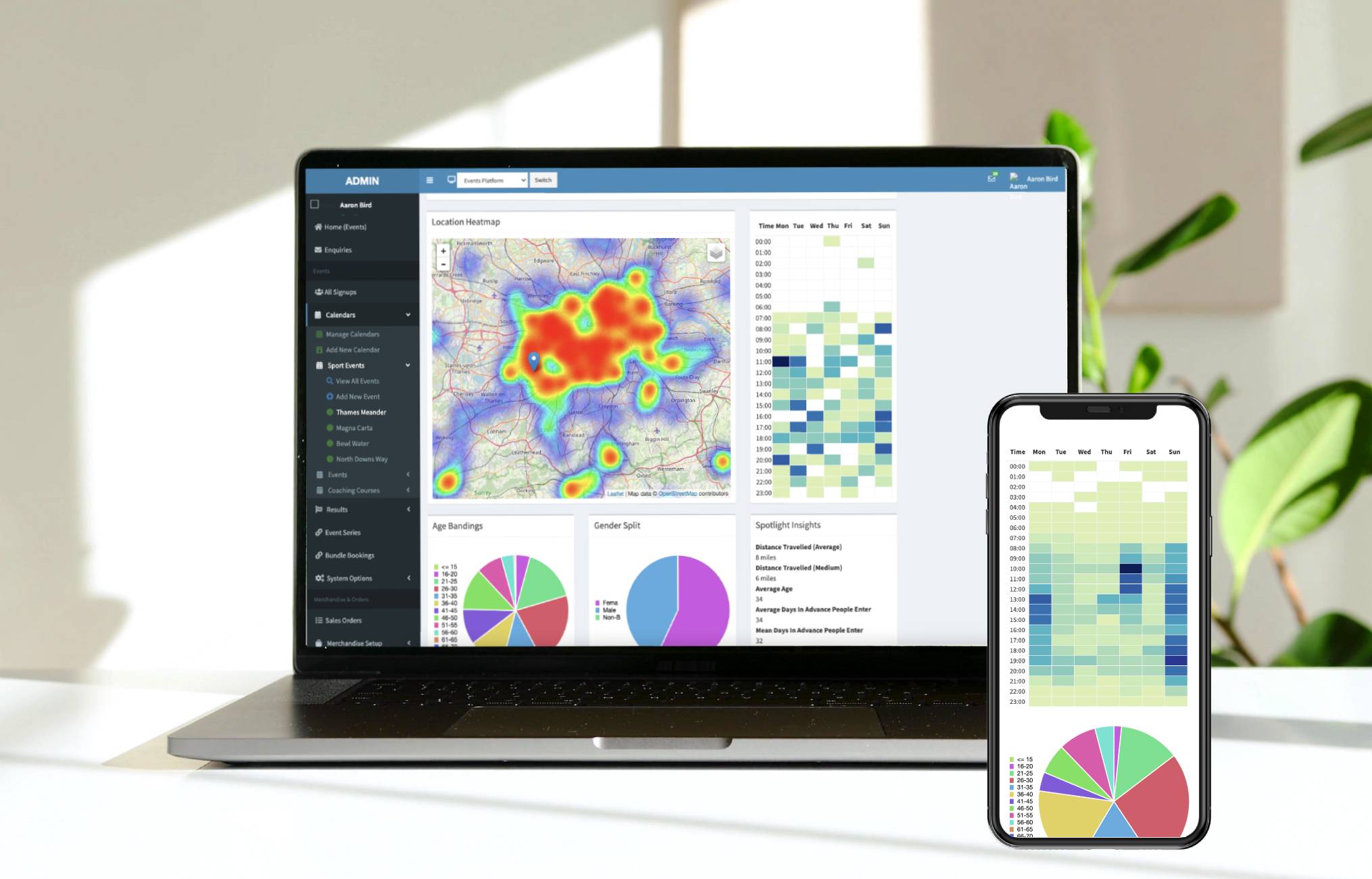
Now however Eventrac’s stunning data visualisations automatically take your current and past event’s raw numbers and turn them into at a glance easily understandable bar, line, matrix or pie charts or heat maps so you can instantly see what’s going on and where you need to focus your attention.
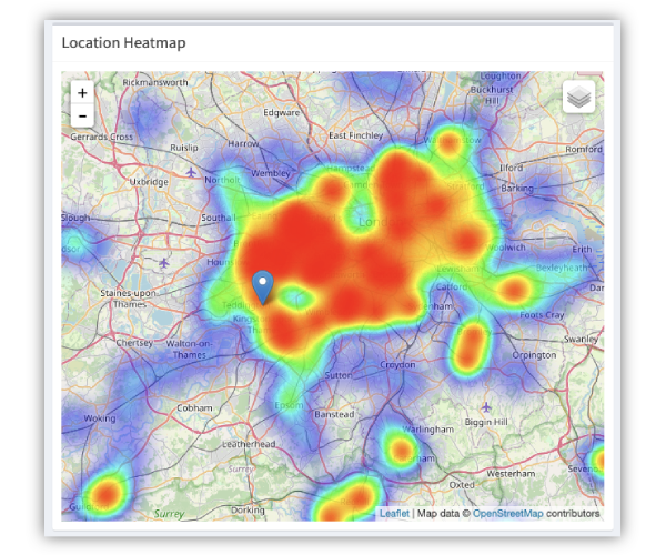
Super Cool Heat Maps
At a glance a Heat Map of your entrants location data will show you where the people who enter your races live and how far they have travelled. This quick analysis will help direct your advertising efforts and over time you will see how the changes you made have worked
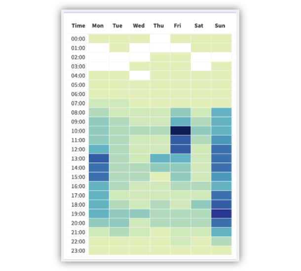
Time/Day Entry Matrix
The story behind this data visualisation reveals the most common signup times for your event or events. This at a glance analysis of Time and Day entry data enables you to maximise the effectiveness of your email and or social media marketing and paid advertising timing the delivery of key messages to achieve your desired outcome
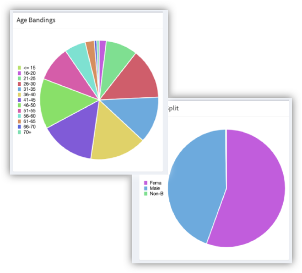
Age and Gender Demographics
A data visualisation of your entrants age and gender can provide you with an instant insight into who finds your events appealing. Perhaps you need to adjust your messaging or your event. Over time comparative data visualisations will reveal the outcome of your actions
Why Do We Visualise Your Data For You
-
A Data Visualisation is much easier to understand than sifting through rows and columns across numerous spreadsheets.
-
Data Visualisations make it easier to compare data over short or long periods of time to see upward and downward trends
-
Data visualisations make the raw numbers, their analysis and the story easier to share with anyone
Your Dashboard Reveals All
With our data visualisations of different data sets on your dashboard, you will have the tools and information you need to help shape your website, email marketing, social media activities. paid advertising and even your overall business model in an accessible and easy-to-share format.